Fields: Edit Tab
The Edit Tab page lets you make changes to the currently selected tab (or planet, in BLUEcloud Mobile for Kids) in the tree. For a top-level tab, the image you specify is used to create the home screen display. The image should be 400x400 pixels.

Any changes made to a tab or app layout only take effect after you choose the ‘Save’ Button at the bottom of the page. Please ensure you choose the Save button on the main app page as well if changes were made within a tab. This saves and applies the changes made to the application.
Mobile Apps > [select a tab] > Edit Tab
Title
Specifies the name of the tab as it displays in the app. This field also applies to the planet names in BLUEcloud Mobile for Kids.
The Custom Colour option lets you specify the text color. When you select Custom Colour, a drop-down list lets you select a color from one of two palettes or specify a color by code.
Subtitle
A short description of the purpose of the tab.
The Custom Colour option lets you specify the text color. When you select Custom Colour, a drop-down list lets you select a color from one of two palettes or specify a color by code.
Button
The graphic or icon to include on the button.
- Image—Displays the Choose File button where you can select the image file to display.
- Icon—Displays an icon palette from which you can select the icon, and color palette from which you can specify a color.
Visibility
The Visibility drop-down menu specifies when the tab should be visible:
| Option | Description |
|---|---|
|
Always |
The tab is displayed on the home screen at all times, regardless of whether the user is logged in or not. Note: If the app is not connected to an ILS that provides authentication service, you should set the Visibility for all tabs to “Always”. |
|
Pre-Login |
The tab shows on the home screen prior to the user logging in. Once the user has logged in, this item disappears until the user logs out again. |
|
Post-Login |
The tab shows on the home screen after the user has logged in. When the user logs out again, the button disappears. |
|
Staff Only |
The tab shows on the home screen only when the user has logged in with a library staff account. |
|
Never |
Hides the tab in the app interface. In BLUEcloud Mobile for Kids, this hides the planet tab within the app. |
Pinned
Specifies that this tab always stays at the top of the tabs on the app's home screen. App users cannot reset the position of the tab in the app preferences. If more than one tab is pinned, they display in the order that they are listed in the tab list of the BLUEcloud Mobile Admin console.
Note: Pinned tabs display as red folders in the BLUEcloud Mobile Admin console.
Header Image
This option is not currently implemented.
Prefix Content
Specifies free form text (or HTML) content at the top of the tab page (does not apply to the built-in types).
Note: You can add a link in the text that opens in the app's browser by clicking Insert/edit link, then selecting Current window in the Open link in drop-down list. The New window option opens the link in the device's default browser.
Tab Contents
The lower part of the page allows you to specify the content of the tab.
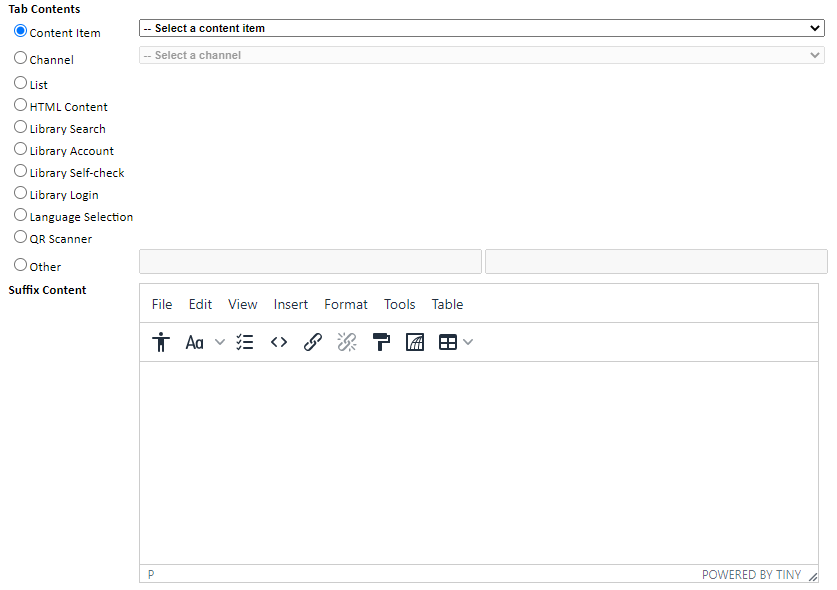
The various options for Tab type are as follows:
| Option | Description |
|---|---|
|
Content Item |
Links to a content item previously created in the admin system. Typically, these content items are web pages for online resources, videos, PowerPoint presentations, and so forth. |
|
Channel |
Creates a button to a single channel under your control, which can be used to display a variety of content. As well as containing a schedule of content, a channel can have location information attached to it (that is, to specify a real world location such as a branch or facility). |
|
List |
The list of libraries that power the “Find my nearest branch” section of the app. In addition, this type is used for tabs that contain sub-tabs. For example, an Online Resources tab that contains subcategories, which then contains an individual tab for each online resource. Each of those tabs can then be a “Content item” type linking to a URL content item. The List option has these options:
|
|
HTML Content |
Provides a space to write your own free form HTML content to be displayed when the user selects this tab. Note: You can add a link in the text that opens in the app's browser by clicking Insert/edit link, then selecting Current window in the Open link in drop-down list. The New window option opens the link in the device's default browser. |
|
Settings |
Sets the tab to display the Login/Logout options along with connecting to other log-in providers (such as Facebook). |
|
Library Search |
Displays the ILS search page so patrons can perform catalog queries of the ILS instance. When you select this Tab type, you have these options:
|
|
Library Account |
Displays the user's own account information. In a library context this will include loans, reservations and charges. |
| Library Self-check |
Displays a page for either scanning the barcode or RFID tag of an item in order to check it out to the user. When you select this tab you have these options:
|
|
Library Login |
Presents the authentication fields for logging in to the library. |
|
Language Selection |
Allows the patron to select which language is used in the app. |
|
QR Scanner |
Displays a QR scanner screen to let users scan QR codes that are posted in the library. When a user scans a QR code, the URL referenced by the code opens in the app's browser. |
|
Other |
This option is not currently implemented. |
Suffix Content
Specifies free form text (or HTML) content at the bottom of the tab page (does not apply to the built-in types).
Note: You can add a link in the text that opens in the app's browser by clicking Insert/edit link, then selecting Current window in the Open link in drop-down list. The New window option opens the link in the device's default browser.
Thanks for your feedback!